

Mastering Vegan Plating: A Guide to Wow-Worthy Presentation
Height and Dimension Techniques
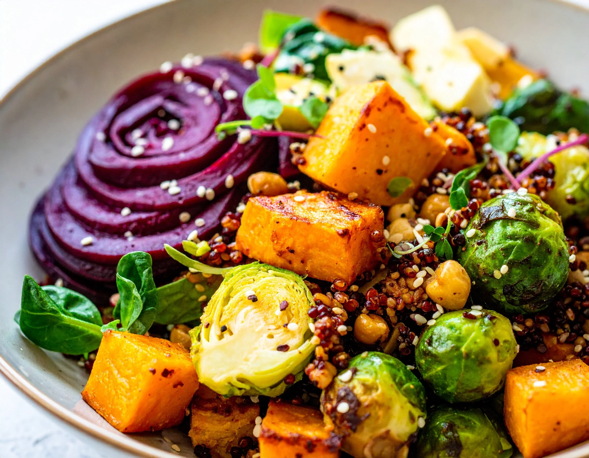
When it comes to plating, height is like the secret weapon you never knew you needed. Think about it: a dish with some vertical action immediately screams, “Look at me!” It’s the food equivalent of great posture. But don’t worry, you’re not building a skyscraper here—this is about a subtle, elegant lift that gives your plate a touch of drama. Layers are your best friend. Stack roasted vegetables like eggplant, zucchini, and bell peppers for a rainbow of textures. Or maybe create a mini avocado-mango tower that’s practically begging to be Instagrammed.
But let’s not stop at stacking. Height isn’t just about piling food up like a game of Jenga. It's about creating dimension, like the plate has a little story to tell. You can lean elements, like propping crispy tofu against a bed of greens, so it looks effortlessly cool—kind of like the James Dean of vegan plating. Or use something unexpected, like a delicate cracker or a crunchy chip, to add height without weighing things down. The goal is balance: you want your dish to look impressive, but not like it’s about to topple over like a poorly built sandcastle.
And while we’re on the subject, let’s talk about shapes. Mixing shapes is a great way to trick the eye into seeing more dimension. Got a bunch of round elements on the plate? Break things up with a rectangle of roasted sweet potato or a triangle-shaped flatbread. Straight lines and curves playing off each other keep the whole look dynamic and exciting. It’s like the visual equivalent of a power couple.
Texture also plays a major role in creating depth. Soft, velvety elements like purees can act as a smooth base layer, while crispy components, like fried shallots or crunchy seeds, add that satisfying pop. Think of your plate like a stage—some ingredients are the main performers, and others are the backup dancers, adding texture and movement to the overall presentation. You want everyone in the audience (or at the table) to be leaning in for a closer look.

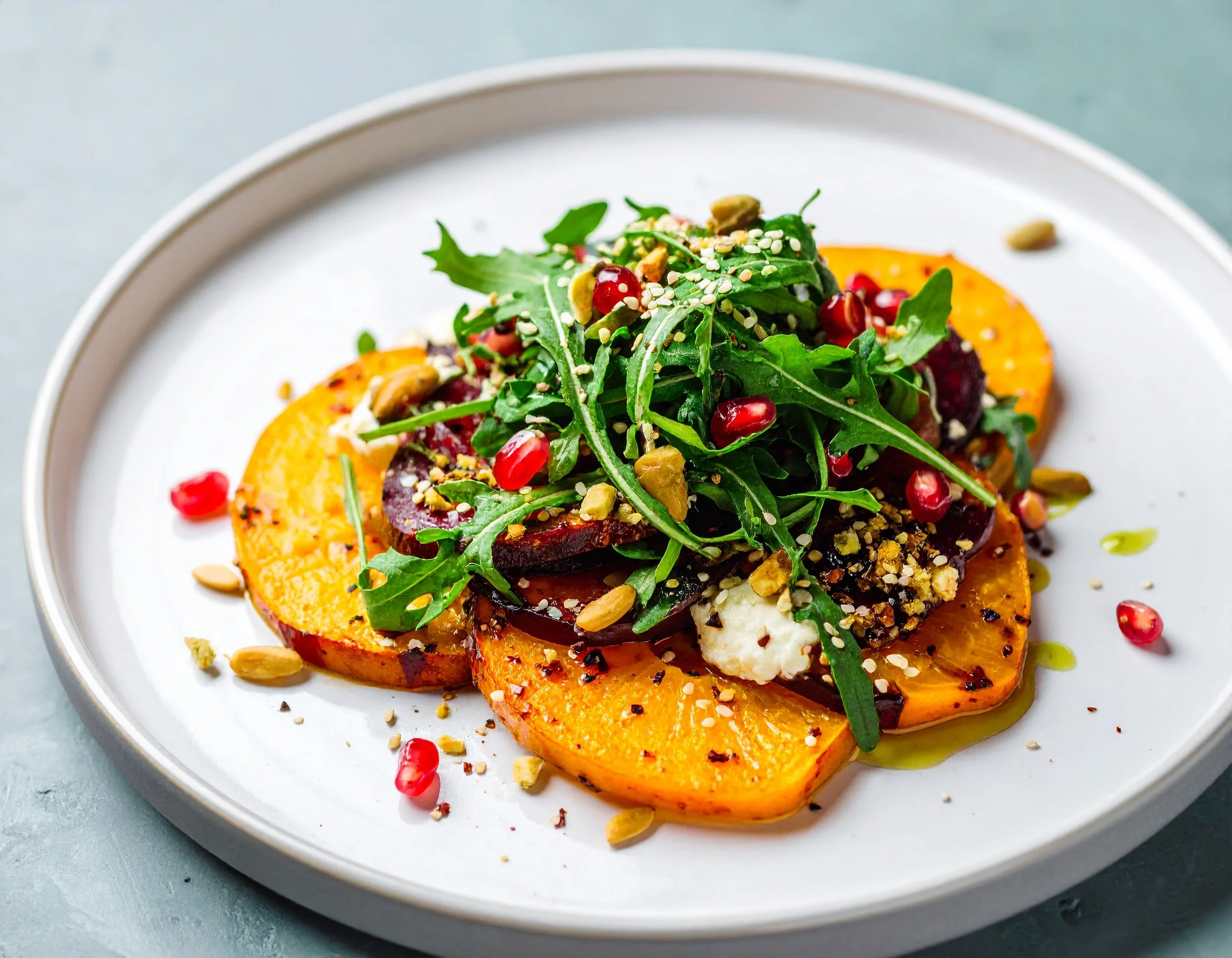
Oh, and don’t underestimate the power of angles. A slight tilt in how you place something can change the whole vibe of the plate. A slice of roasted beet balanced on its edge instead of lying flat suddenly turns it into a piece of edible architecture. Even something as simple as laying a wedge of citrus at an angle instead of straight up and down can make your plating look way more polished. It’s those little details that separate the pros from the amateurs.
Props can also come in handy—but don’t go overboard. A well-placed ramekin of sauce or a crisp cracker standing upright can add height without stealing the spotlight. And if you’re really feeling fancy, try using edible garnishes like baked vegetable chips or crispy herbs to add both lift and texture. Just be sure everything you add is functional, not just pretty. After all, this is food, not a museum exhibit.
And remember, height doesn’t have to mean formal or fussy. A tall stack of fluffy pancakes at brunch is just as effective as an avant-garde vegetable sculpture. Whether you’re going for chic and modern or cozy and approachable, height adds that little something extra. So grab your plating tools, and let’s get stacking!
Color Balance and Contrast

Color is the silent hero of any beautifully plated dish. It’s that extra little nudge that says, “Hey, this is going to taste amazing.” But getting it right is an art form—you’re not just tossing random hues onto a plate like you’re finger painting. No, this is about crafting a visual feast that makes people’s eyes light up before their forks even hit the table.
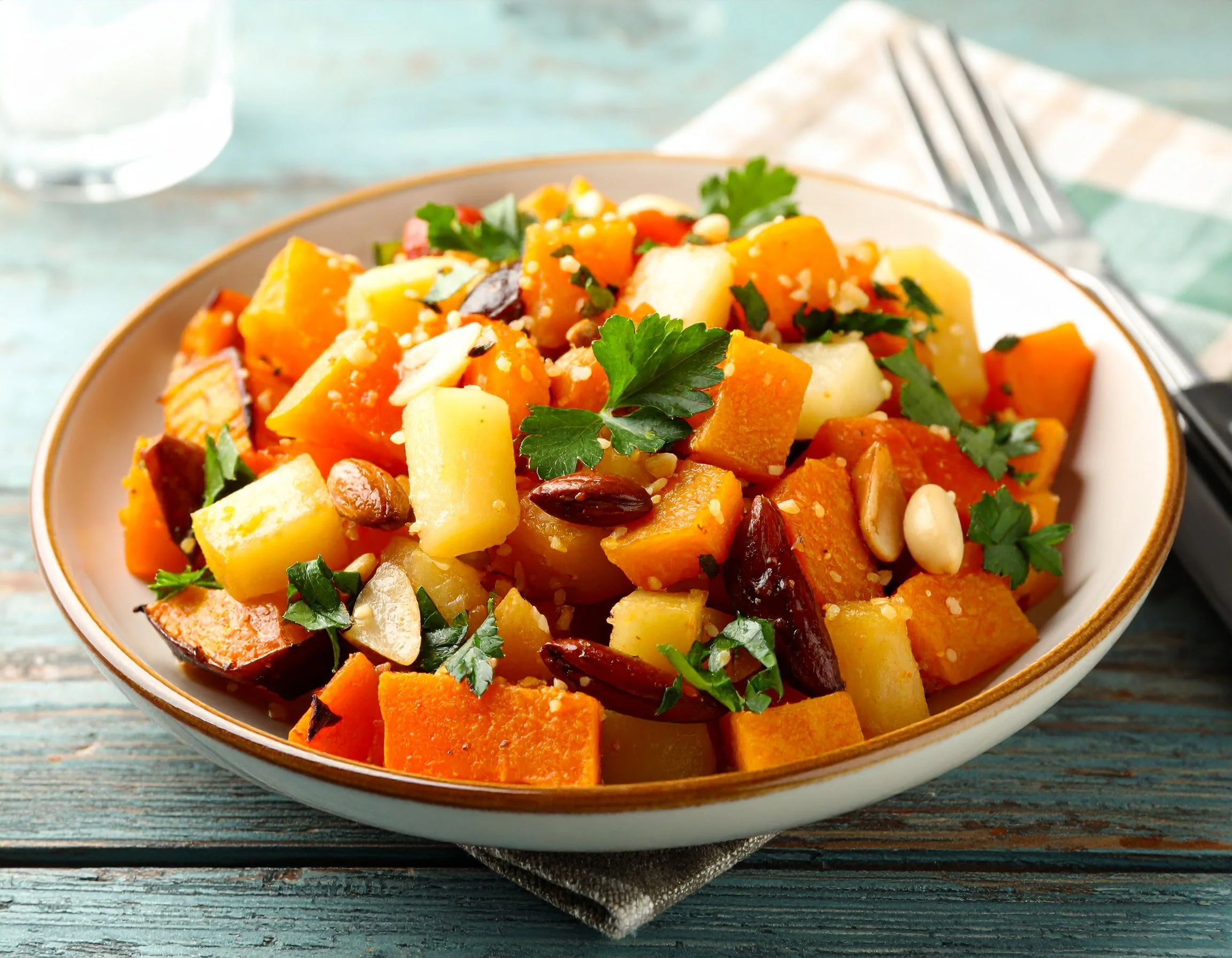
First things first: think about your plate like it’s a blank canvas, and you’re the next great artist. The key is to pick a range of colors that pop without turning the whole thing into a chaotic mess. Start with a base—something neutral, like a creamy cauliflower puree or some fluffy couscous. Then, layer in those bold, vibrant colors that practically shout “fresh and delicious!” Deep orange roasted carrots, bright green snap peas, ruby-red pomegranate seeds—they’re all fair game. And hey, don’t forget about earthy tones like golden brown roasted mushrooms or deep purple eggplant to anchor the whole look. It’s all about balance, not a confetti explosion.
Contrast is where the magic happens. Think about pairing opposites to make each color shine. A sunny yellow curry against a bed of black rice is a power move. Or imagine the crisp, clean white of a coconut yogurt sauce drizzled over roasted crimson beets. The colors don’t just sit there; they play off each other, making everything look more vibrant. Bonus points if you can add an unexpected twist—like a sprinkle of bright pink pickled onions on top of an otherwise earthy-toned dish. It’s the edible equivalent of a mic drop.
Now, let’s talk about transitions. You don’t want one side of the plate to look like a neon parade while the other is stuck in a beige wasteland. Smooth it out. Think of a gradient—a flow of colors that guides the eye across the dish. For example, place pale green avocado slices next to vibrant cherry tomatoes, followed by a scattering of toasted quinoa for texture. It creates a natural rhythm that feels cohesive, not chaotic.
And while we’re on the topic of creating visual interest, let’s not ignore how textures and colors team up. Think glossy, glistening sauces paired with matte, roasted veggies. Or how about the sparkle of flaky sea salt or edible flowers over a smooth soup? Even something as simple as adding a bright green drizzle of parsley oil to a bowl of butternut squash soup can elevate the whole thing. Texture and color are like peanut butter and jelly—they’re just better together.
Another trick? Play with temperature to enhance your colors. For example, a roasted red pepper looks bold and rich when it’s fresh out of the oven, but if you let it cool to room temp, its color might dull. The same goes for leafy greens—hit them with a quick sauté to make their color pop, but don’t overcook them into a sad, wilted mess. Heat works like magic on pigments, so use it wisely.
And don’t forget, the plate itself can influence how your colors are perceived. White plates are classic for a reason—they make your ingredients look brighter and more defined. But if you want to get a little wild, try plating on black, slate, or even colorful ceramics. The right backdrop can take your color palette from pretty good to absolutely stunning. Just don’t let the plate steal the spotlight—this is still all about the food, after all.
Oh, and if you’re working with ingredients that are all in a similar color family—like a golden beet salad with roasted sweet potatoes and turmeric dressing—break it up with something that contrasts. A few purple basil leaves or a sprinkle of toasted pistachios can add just enough variation to keep things interesting. Think of it as the visual exclamation point on your edible masterpiece.
Color also isn’t just about aesthetics; it’s about signaling flavor. Bright reds and oranges scream bold and tangy, while greens tend to whisper “fresh and herbaceous.” Pay attention to what your colors are saying, and make sure they match the flavor story you’re trying to tell. No one wants a plate that looks exciting but tastes like cardboard.
Sauce Application Methods
When it comes to sauce, it’s not just about taste—it’s a whole production. A great sauce application can turn your dish into a jaw-dropping centerpiece, the kind of plate people hesitate to eat because it’s *too* pretty. And no, you don’t need to be a culinary Picasso to pull it off. All you need is a little creativity and some tools that double as your culinary magic wand.
First, let’s talk tools of the trade. Spoons, squeeze bottles, and even paintbrushes can transform sauce into edible artwork. A trusty spoon isn’t just for stirring—it’s perfect for creating those dramatic swooshes that scream sophistication. Drag it through a dollop of red pepper coulis, and suddenly your plate looks straight out of a five-star kitchen. Meanwhile, squeeze bottles? Total game-changers. They’re your secret weapon for precision—dot, drizzle, or even draw patterns like a pro. Feel like adding a flourish? Dip a small pastry brush into a rich green pesto and give the plate a gentle swipe. It’s less “messy dinner” and more “Michelangelo would be jealous.”
Now, let’s get into the fun part: how to actually get that sauce on the plate. Don’t just slap it on there like you’re rushing to catch the next episode of your favorite show. Think about the vibe of your dish. Is it playful and bright? Go for bold, clean lines or polka dots that feel whimsical. More elegant and subdued? Try a minimalist design—maybe a single streak of sauce sweeping across the plate, like a food runway. If you’re really feeling adventurous, use a spoon to create an ombré effect by dragging one sauce into another, blending the colors like you’re plating a sunset.
Layering sauces is another trick to take things up a notch. This isn’t about piling them up like a condiment buffet—it’s about creating depth and contrast. Picture a swirl of creamy cashew sauce topped with a few dollops of vibrant herb oil. Not only does this add visual intrigue, but it also gives the diner that “wow” moment when the flavors come together. Bonus points if your sauces bring different textures to the table: velvety, glossy, chunky—mix it up. Variety isn’t just the spice of life; it’s the sauce of life too.
Placement is key, though. Sauces can frame a dish, highlight its best features, or even steal the spotlight (in the best way). A zigzag of teriyaki glaze around a tofu stack adds drama without overshadowing the main act. A few small dollops of beet puree circling a roasted carrot salad? Chic and modern. And don’t sleep on negative space—it’s your secret ally in creating that high-end aesthetic. A clean, white plate with a small but striking pool of sauce in one corner can make your food look like it’s living its best minimalist life.
While you’re in creative mode, don’t be afraid to embrace geometry. Straight lines, arcs, spirals—sauce can bring structure to your plate. A neat row of dots trailing off the edge of a rectangular plate gives a modern, edgy feel. Meanwhile, a sweeping curve of coconut-lime dressing around a tropical quinoa salad is like a visual hug for the ingredients. And if you’re working with round plates, spiral designs can draw the eye toward the center, focusing attention exactly where you want it.
One pro tip? Use the sauce to guide the diner’s fork. Sauce placement can subtly suggest how someone should approach the dish. A pool of tahini at the edge of the plate, for example, invites them to drag a bite of falafel through it, while a drizzle over a roasted vegetable platter encourages them to get all the flavors in one glorious bite. It’s like leaving a little roadmap to flavor town.
But let’s get real: the sauce isn’t just there to be pretty—it’s there to amp up the flavors of the dish. If your roasted sweet potato and black bean enchiladas are the Beyoncé of the plate, the mole sauce is definitely the Kelly Rowland—essential and unforgettable. Keep the flavors in balance with the dish, and make sure the application highlights, rather than hides, what’s underneath.
Garnish Placement Strategy
Garnishes are like the accessories of the culinary world—they’re not the star of the show, but wow, do they have the power to pull the whole look together. Think of them as the earrings or the pocket square that takes an outfit from fine to fabulous. But let’s be clear: this isn’t about tossing a handful of parsley on the plate like you’re sprinkling confetti at a birthday party. Garnishing is an art, and with a little intention and creativity, it can transform your dish into a masterpiece.
Start by thinking about the story you want your plate to tell. Garnishes shouldn’t feel like an afterthought—they should connect to the flavors, textures, and vibe of the dish. Are you serving up a warm, hearty grain bowl? A scattering of toasted sesame seeds or crushed pistachios can add a bit of crunch and a touch of sophistication. Going for something light and summery? Maybe a few delicate microgreens or edible flower petals are just what you need to give it that extra burst of freshness. The key is to make sure your garnish adds to the dish, both visually and flavor-wise, without stealing the spotlight.
Placement is where the magic happens. Instead of plunking everything in the middle of the plate, think about how the garnish can guide the eye across the dish. Sprinkle chopped chives in a diagonal line for a dynamic look, or cluster pomegranate seeds around the edge of a salad for a pop of vibrant color. Want to add some height? Tuck a sprig of fresh rosemary or a crisp cracker standing upright for a little vertical flair. It’s like arranging flowers—only these taste way better.
And speaking of taste, don’t forget that garnishes should bring more to the table than just a pretty face. The best garnishes add a flavor boost or textural contrast. For example, a pinch of flaky sea salt sprinkled over roasted vegetables can make their natural sweetness sing. Or a quick zest of lemon over a plate of pasta can brighten the whole dish in one simple step. It’s these small, thoughtful touches that turn “good” into “next-level delicious.”
Now, let’s talk about proportion. It’s tempting to go all out when you’ve got a fridge full of potential garnishes, but restraint is your friend here. Too much, and your plate starts looking like it’s auditioning for a reality show called *Garnish Gone Wild.* The goal is to enhance, not overwhelm. A few well-placed elements will always look more polished than a chaotic sprinkle-fest.
Texture is another hero in the garnish game. Think about what your dish might be missing. Is everything on the plate soft and creamy? Add a crisp, crunchy garnish, like fried shallots or roasted chickpeas, to break things up. On the flip side, if your dish is all about crunch, balance it out with something smooth and luxurious, like a dollop of cashew cream or a swirl of tahini. It’s all about creating balance so every bite feels exciting and satisfying.
Color, of course, is a huge part of the equation. A bright garnish can liven up an otherwise monochromatic dish. Imagine a deep orange butternut squash soup with a swirl of green herb oil and a sprinkle of ruby-red pomegranate seeds—it’s practically begging for a close-up. But don’t just throw on the first colorful thing you can find. Make sure the colors harmonize with the overall palette of the dish. You’re not painting by numbers here; you’re creating a composition.
Finally, remember to keep it functional. If you’re adding edible flowers, make sure they actually taste good with the dish (and that they’re safe to eat—this isn’t the time to test your knowledge of backyard botany). And if you’re using a garnish with a strong flavor, like fresh mint or dill, use a light hand. You want it to complement the dish, not hijack it.